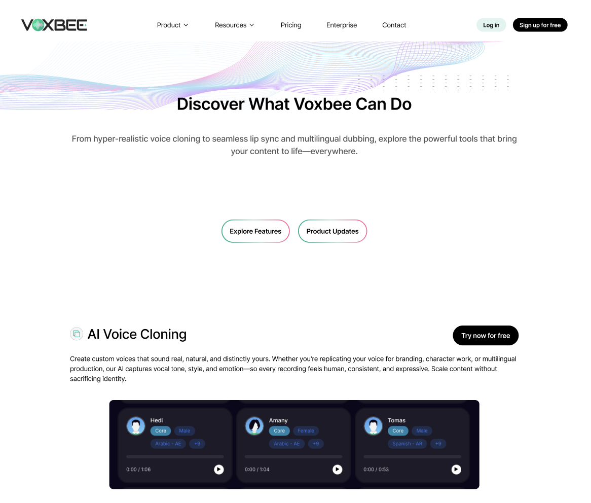
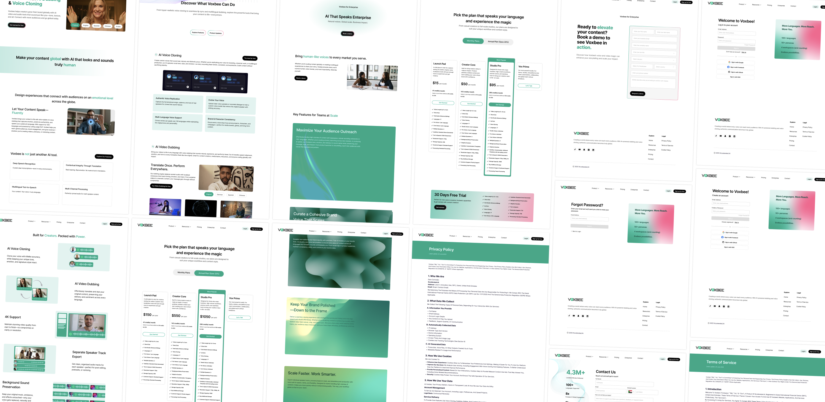
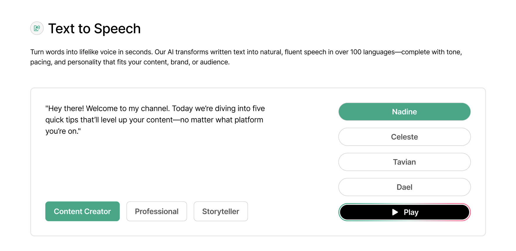
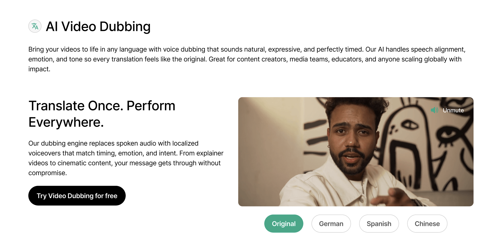
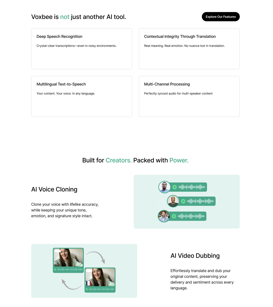
Shipped

Voxbee

Leading the full web redesign of Voxbee, an AI-powered dubbing and voice cloning tool, in order to establish credibility, build a professional brand identity, and increase conversion amongst content creators.

Role
UI/UX Design Lead
Timeline
Jun. 2025 – Aug. 2025
Platform
Web
Skills
UX design
User research / testing
Brand Development
Content Strategy
01 | Background

Voxbee is a dubbing tool helping creators break language barriers and reach global audiences.

As the flagship product of Xccelerated AI, Voxbee gives content creators a way to translate their videos and voices, while maintaining their unique tone, texture, and personality that makes them them.

Voxbee redesigned screens localizing video across languages
02 | Problem

The website failed to engage and convert users.

Three months after launch, Voxbee still struggled with user engagement, onboarding clarity, and converting visitors into active users. To combat this, the team proposed a complete redesign with fresher visuals and sharper content.

Stakeholders wanted to see

  • A clean & professional visual identity
  • An industry-standard site structure
  • Messaging tailored towards content creators

Stakeholders did not like

  • Lack of professional appeal
  • Cluttered & unpolished structure
  • Unclear language, identity, and messaging
Our guiding question

How might we create a more intuitive and trustworthy website experience that clearly communicates Voxbee's value to content creators?

03 | Research

First, I studied how the category leaders earn creator trust.

I ran a competitive analysis of leading AI voice and dubbing platforms, examining how they structure their pages, surface demos, and speak to creators.

After auditing similar platforms, we decided to focus on the three patterns that consistently won creators over: demos shown before the ask, a linear page structure, and plain-spoken, creator-first language. The strongest sites earned trust on first impression by showing the output instead of describing it and by stripping away the dense, feature-listing layouts that made Voxbee's original site feel overwhelming.

04 | Empathize

Before sketching anything, I wanted to hear it from actual creators.

To ensure the redesign was guided by actual user input, I led 6 user interviews with content creators, walking them through the existing site and taking note on what landed, what confused them, and whether they'd trust this product.

What are your initial thoughts when landing on the site?

Is it easy to navigate and find what you're looking for?

Does this feel like something made for you as a content creator?

Would you trust this product? Why or why not?

Three key insights surfaced across all 6 participants:

Insight 01

Low perceived trust & credibility

"I'd need to see examples or demonstrations before committing to this."

Insight 02

Cluttered & overwhelming experience

"There's a lot going on. I'm not sure where to look."

Insight 03

Not tailored to content creators

"This doesn't really feel like it's made for someone like me."

These insights revealed that the core issue wasn't just visual. The issue was a lack of clarity, focus, and creator-centered communication.

05 | Scoping the Work

Narrowing in on the highest-impact areas first.

With both stakeholder input and user insights in hand, I scoped the project around the three areas that would most directly address user confusion and then mapped lower-priority work behind them.

1

Landing page redesign

First point of contact. Biggest opportunity to improve clarity, trust, and engagement.

2

Messaging & content strategy

Refocusing language to speak directly to content creators and clarify Voxbee's value.

3

Visual system & brand direction

Establishing a clean, professional identity that earns credibility on first impression.

Lower priority — still important
4

Secondary pages

Features, pricing, enterprise — the standard pages users expect on a product site.

5

Interactive demo content

Hands-on examples to give creators a real feel for what Voxbee can do.

Allocating efforts this way meant we could ship the most critical pain points within an 8-week window without dropping the supporting structure!

06 | Decisions & Tradeoffs

Three intentional tradeoffs shaped the final designs.

Text-to-Speech demo with preset texts and voices

Tradeoff 01: Text-to-Speech demo

Decision
Simplified the demo to preset texts and voices.
Why
Free-text and open language input wasn't feasible for engineering within the 8-week window.
Tradeoff
Users have less flexibility, but still get to experience the feature before signing up.
AI Video Dubbing interactive preview AI Voice Cloning interactive preview

Tradeoff 02: Trust over decoration

Decision
Prioritized proof points and interactive demos over purely aesthetic visuals.
Why
Credibility was the #1 concern surfaced in user research.
Tradeoff
Required heavier dev coordination and more time to design interactive demos.
Voxbee is not just another AI tool — creator-focused messaging

Tradeoff 03: Clarity over complexity

Decision
Prioritized clear messaging and usability over visually bold or dense design.
Why
Users were overwhelmed at first glance They needed to understand Voxbee before being impressed by it.
Tradeoff
Reduced visual boldness in favor of comprehension.
07 | Key Improvements

Key improvements side-by-side.

Guided by user insights, stakeholder input, and feature prioritization, several major improvements were made from the original site to the redesign.

01

Clean & professional visual identity

Before Old Voxbee landing — dense text on a flat block

Users expressed feeling overwhelmed and confused by the dense blocks of text and unfocused structure of the original site, which resulted in quick drop-off and low perceived trust.

After Redesigned Voxbee landing — clear hero with video preview

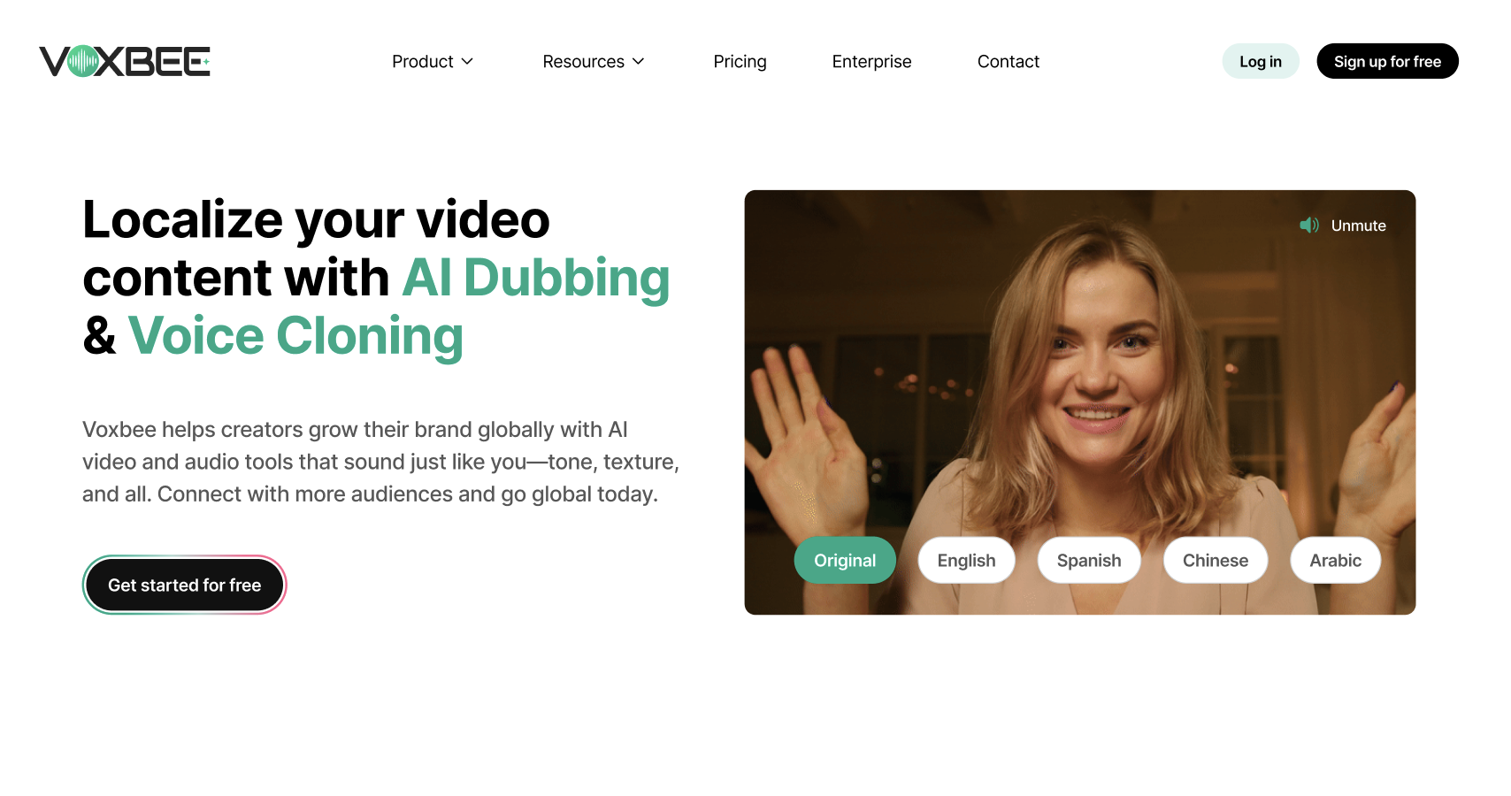
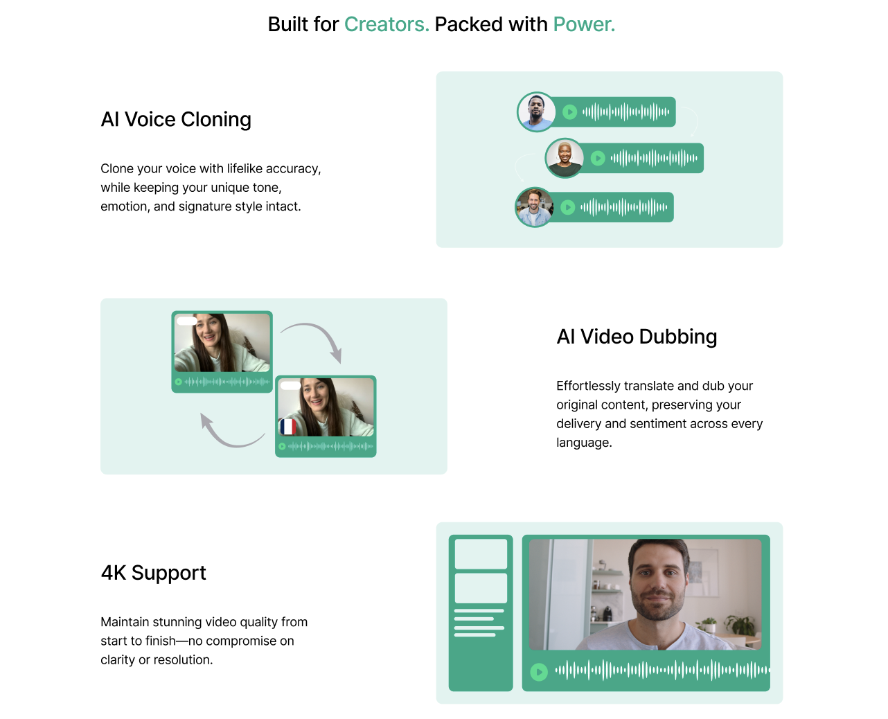
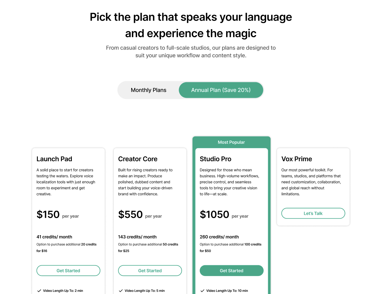
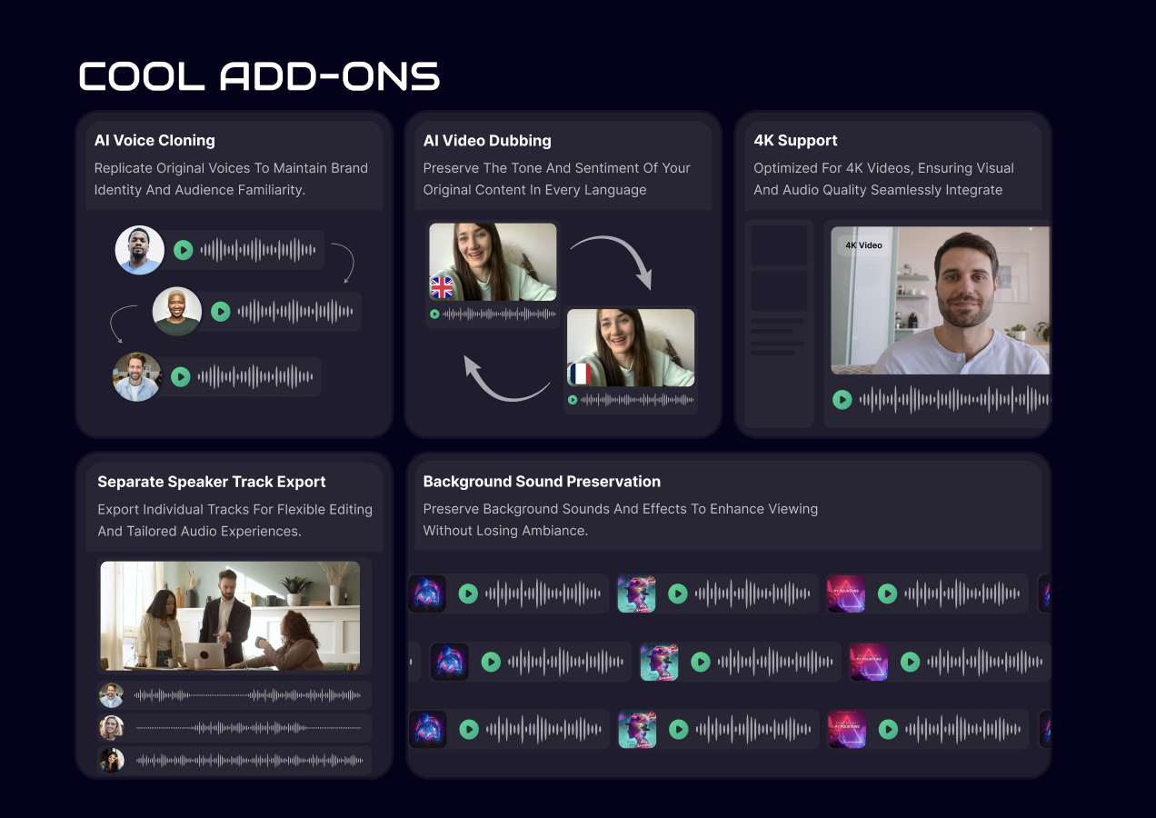
To combat this, the redesign features digestible chunks of information, a refined visual identity, and an organized information architecture.

02

Focused messaging, tailored to creators

Users previously felt the website wasn't creator-friendly and that the language felt disjointed. The new messaging shifts away from simply explaining Voxbee's mission and functionalities toward more connected language that showcases how Voxbee could enhance content creators' global reach.

Before — Mission-first

"We're on a mission to humanize AI voice dubbing — driving more views, expanding your reach, and winning more fans."

After — Creator-first

"Voxbee helps creators grow their brand globally with AI video and audio tools that sound just like you — tone, texture, and all."

03

Industry-standard pages, added

With only Landing, Pricing, and Sign in pages, the previous site made users and stakeholders question the professionalism and credibility of Voxbee. The new site adds Enterprise, FAQ, Demo Booking, Contact, and Resources pages.

Before — Only landing, pricing & sign in Old Voxbee site — single dark landing page
After — Complete industry-standard site
Discover page Built for Creators page Pricing page Enterprise page
04

Interactive demos that build trust

In interviews, many creators expressed wariness due to a lack of demonstrations and examples. So we took it a step further by introducing interactive demonstrations that let creators tinker with the features first-hand and build familiarity trust before committing.

Before — Static explanations Old Voxbee site — static Cool Add-ons section
After — Interactive demonstrations
08 | FINAL SOLUTION

A site that earns trust on first impression and speaks to creators first.

Clear Value Proposition for Creators

An engaging first impression that introduces the product, highlights its benefits, and gives creators an overview of how it works in simple terms.

Building Trust through Demos

An interactive breakdown of Voxbee's tools that lets users explore the product hands-on. Real demos build credibility by showing, not just telling, how the dubbing and voice cloning work.

Pricing Plans

A clear overview of pricing tiers designed to fit different needs, helping users quickly understand which plan works best for their workflow and scale.

Built for Scale

Tailored messaging for enterprise teams, showcasing Voxbee's value for large organizations.

09 | Impact

The redesign moved from kickoff to developer-ready in two months and resulted in:

15 redesigned web screens

6 content creators interviewed

Developer-ready in 8 weeks

15% increase in engagement & demo requests

10 | Learnings

Learnings to take going forward!

Turning ambiguity into clarity

Starting with an unclear brief from stakeholders, I was pushed to take initiative, set up meetings, ask better questions, and build a habit of speaking up early when things don't add up.

Effectively communicating with developers

The best designs are the ones that ship! Learning to balance user needs with technical constraints by communicating closely with developers was essential.

Clear messaging is the foundation of good design

No matter how strong the visuals, users need to understand the product first. Clarity will always beat flash.

Being a stronger leader

This was my first time as a design lead. I learned how to trust my teammates, delegate effectively, and act as the connective tissue between design, engineering, PM, and stakeholders.